Mastering Flexbox and Grid: A Practical Guide for Beginners
- Code Scaleup

- April 19, 2025
- No Comments
In modern web development, CSS layout systems like Flexbox and Grid have transformed how we build responsive, flexible, and well-structured web designs. Whether you’re new to frontend development or upgrading from older techniques like floats and inline-blocks, understanding Flexbox and Grid is essential.
In this beginner-friendly guide, we’ll break down both layout systems, explain their differences, provide examples, and share practical use cases to help you decide when and how to use them.
🌟 Video Guide
🔧 What is Flexbox?
Flexbox (Flexible Box Layout) is a one-dimensional layout model designed for arranging items in a row or column. It excels at distributing space along a single axis and is perfect for aligning elements horizontally or vertically.
✅ Key Features of Flexbox:
Layouts along one axis (row OR column)
Automatic spacing and alignment
Dynamic resizing of child elements
Works well for components like navbars, cards, and forms
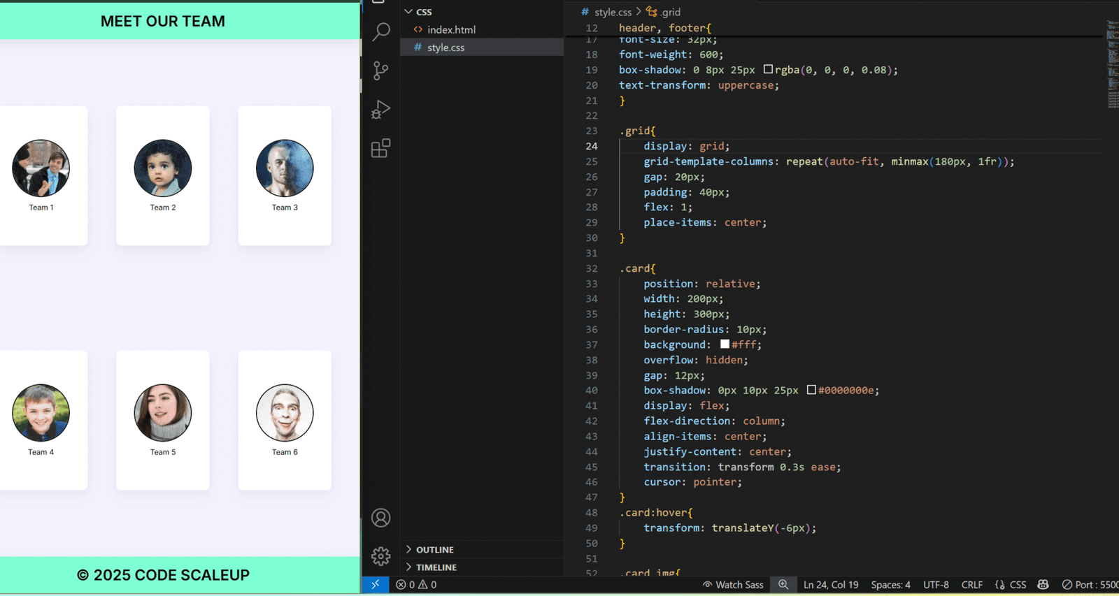
🧱 What is CSS Grid?
CSS Grid Layout is a two-dimensional layout system that allows developers to design layouts using rows AND columns simultaneously. It’s ideal for creating full-page layouts or complex design structures.
✅ Key Features of Grid:
Layouts in both horizontal and vertical directions
Explicit placement of elements
Easily create overlapping components
Great for building responsive page structures and dashboards
🔍 Flexbox vs Grid: What’s the Difference?
| Feature / Aspect | Flexbox | CSS Grid |
|---|---|---|
| Layout Type | One-dimensional (row or column) | Two-dimensional (rows + columns) |
| Best For | Aligning items in a row or column | Full-page layouts, grids |
| Item Placement | Content-based flow | Precise placement using grid lines |
| Responsive Design | Easier for small components | Easier for full layouts |
| Complex Layouts | Harder to manage | More control, better for complex structures |
| Alignment Options | Main axis + Cross axis | Row & Column alignment separately |
| Browser Support | Widely supported | Widely supported (modern browsers) |
💡 When to Use Flexbox
Navigation bars
Toolbars
Horizontal/vertical centering
Aligning form fields
Small card layouts
🌟 DOWNLOAD ZIP
👉 Flexbox Example:
<div class=”flex-container”>
<div>Box 1</div>
<div>Box 2</div>
<div>Box 3</div>
</div>
<style>
.flex-container {
display: flex;
justify-content: space-between;
align-items: center;
}
.flex-container > div {
background: #eee;
padding: 20px;
margin: 5px;
}
</style>
💡 When to Use CSS Grid
Web page layout (header, sidebar, content, footer)
Image galleries
Dashboards
Blog or portfolio layouts
👉 Grid Example:
<div class=”grid-container”>
<div class=”item1″>Header</div>
<div class=”item2″>Sidebar</div>
<div class=”item3″>Content</div>
<div class=”item4″>Footer</div>
</div>
<style>
.grid-container {
display: grid;
grid-template-areas:
‘header header’
‘sidebar content’
‘footer footer’;
grid-template-columns: 1fr 3fr;
gap: 10px;
}
.item1 { grid-area: header; background: #ddd; }
.item2 { grid-area: sidebar; background: #eee; }
.item3 { grid-area: content; background: #ccc; }
.item4 { grid-area: footer; background: #bbb; }
</style>
🚀 Benefits of Using Flexbox & Grid
🌟 Flexbox Benefits
Simplifies alignment and spacing
Great for responsive components
Clean, readable syntax
🌟 Grid Benefits
Allows precise control over complex layouts
Reduces the need for nested divs
Easier media queries using
grid-template-areas
🌟 DOWNLOAD ZIP
🧠 Final Thoughts
Flexbox and Grid are not competitors—they’re complementary tools. You’ll often find yourself using both in a single project. Mastering these layout systems will make your web designs more powerful, more responsive, and easier to maintain.
So, start with Flexbox for small UI components, and use Grid for larger layout structures. Practice with real-world examples, and you’ll be a layout master in no time!